

The Knowledge Base Of
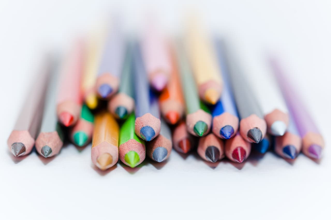
Art Supplies
Understand your materials and start creating to your fullest potential.
.jpg)

.jpg)
.webp)

Science First. No Marketing Fluff.
Everything you need to make informed decisions about choosing the right art supplies
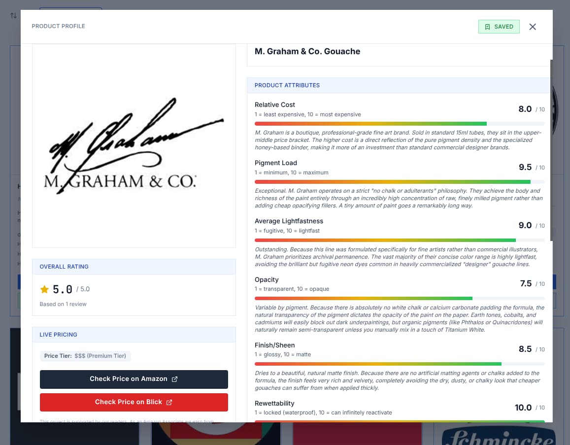
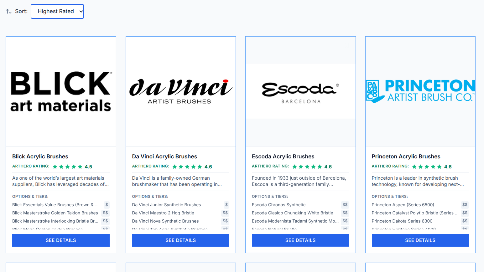
Compare Product Attributes At A Glance
The most comprehensive independent knowledge base of art materials on the planet
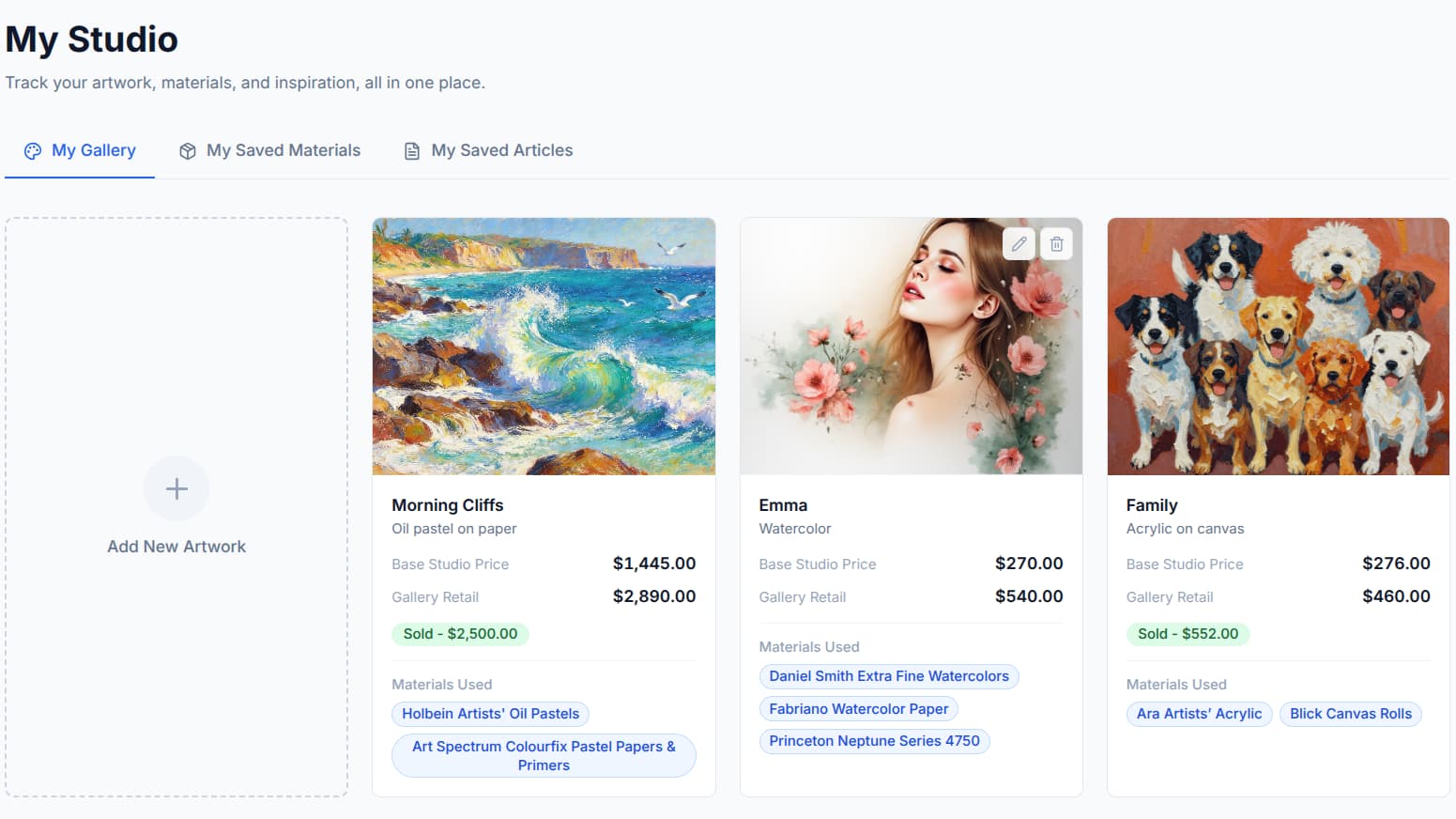
Your Private Digital Studio
Save your artwork, materials, sales data and more in your own digital studio
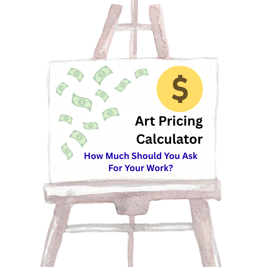
Artwork Pricing Calculator
Sometimes pricing your art can be as tough as making it!
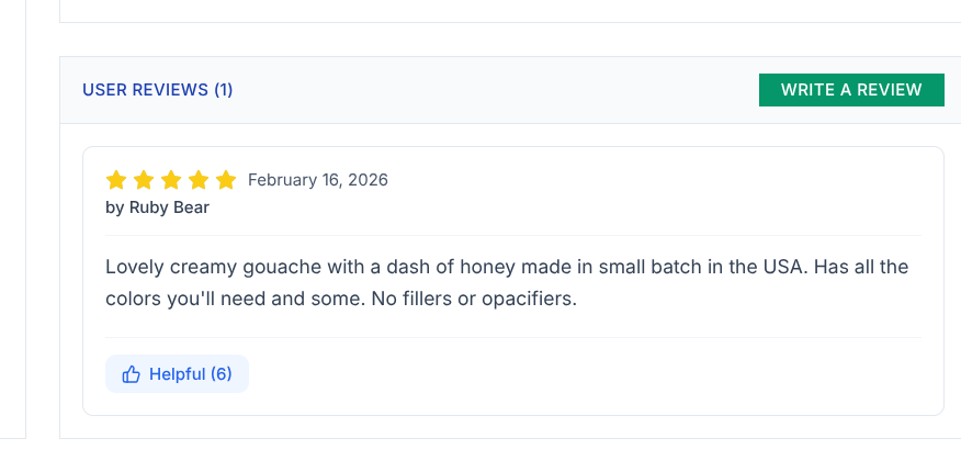
User Reviews
Read reviews from other artists, and leave your own experiences to help others!
ArtHero Ratings
Curated through lifetime experiences of art materials professionals and artists of all levels
We're loved by artists everywhere!
"Great info on brushes, explains it all"
Bev B
Watercolor artist
"This is so helpful!"
Marian Van R
Acrylic artist
"Wow! Thank you! Definitely saving this! I appreciate it 🙏🏼"
Kathryn KJ
Acrylic artist