
Compare Watercolor Paints
.jpg)
Choosing a watercolor paint isn't so easy. It requires balancing of many things- the format (tube or pan), pigment quality, binder type, transparency, granulation, lightfastness, flow characteristics, and cost.
Besides the paint, the paper you choose is an important part of watercolor chemistry that needs proper understanding. Visit our Watercolor Paper page for a more detailed explanation.
The Art and Science of Watercolor
Watercolor is essentially pigment stained onto paper using water. It is highly portable, non-toxic, and possesses a beautiful, luminous quality that no other medium can mimic. However, it is also unforgiving. Because the paint is transparent, you cannot simply paint over a mistake with white paint. The ultimate goal of watercolor is learning to control the water cycle and preserving the natural white of the paper.
Choosing your first set of paints is a crucial step in your artistic journey. Should you start with professional-grade colors, or is a high-quality student grade better for learning water control? Will a paint with honey as a binder change your style?
Here is everything you need to know to build your palette.
Unlike oils or acrylics, the physical packaging of your watercolor paint dictates your workflow.
Pans (Dry Blocks): Ultra-portable and great for travel or field sketching. It is harder to waste paint, making them highly economical. However, it can be tedious to mix large puddles of dark, saturated color quickly.
Tubes (Wet Paint): Provide instant, intense color. Tubes are essential if you prefer to paint large washes or work on a massive scale.
Grade (Student vs. Professional): Student grade paints (like W&N Cotman or Van Gogh) are excellent for beginners, but they commonly use synthetic "hues" and fillers instead of expensive, genuine pigments. Professional paints (like Daniel Smith or W&N Professional) feature massive pigment loads and exotic, single-pigment formulas.
The Verdict: Start with a good student-grade pan set (or a mix of pans and tubes). They are much easier to manage and control as a beginner.
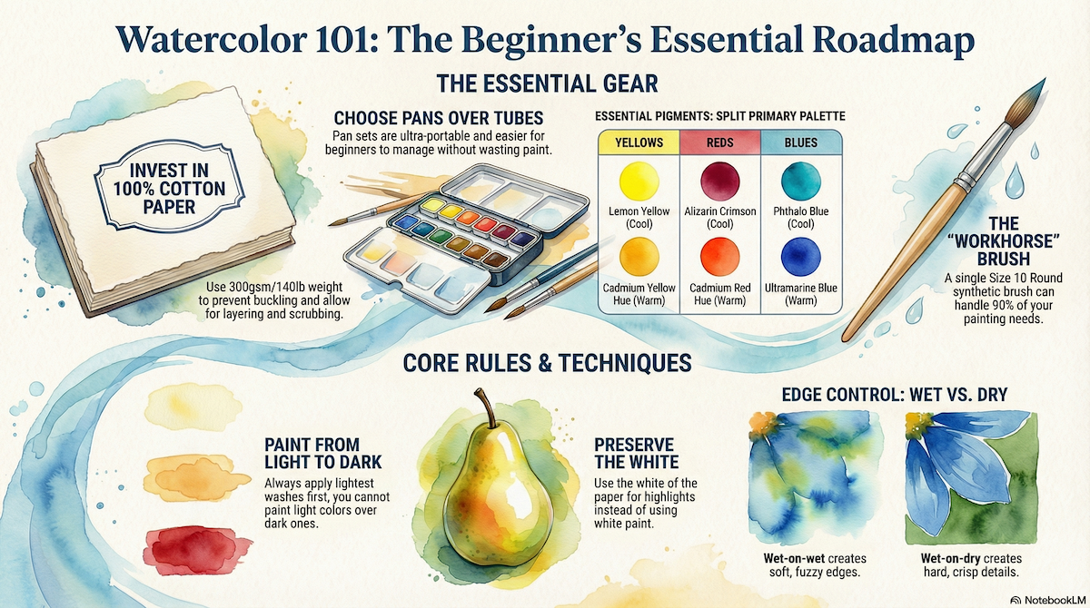
In watercolor, you do not need white paint; you use the unpainted paper for your highlights. Pros rarely mix with "Chinese White" because it makes colors look chalky and opaque. Instead, build a versatile "Split Primary" palette featuring a warm and cool version of every primary color:
Lemon Yellow (or Hansa Light): The "cool" yellow.
Cadmium Yellow Hue (or New Gamboge): The "warm" (golden) yellow.
Cadmium Red Hue: The "warm" red.
Alizarin Crimson: The "cool" red (absolutely essential for mixing purples).
Ultramarine Blue: The "warm" blue. It granulates beautifully for texture.
Phthalo Blue (or Intense Blue): The "cool" blue. It stains the paper heavily.
Burnt Sienna: A vital earth tone. Mix this with Ultramarine to make a perfect, glowing grey/black.
Payne's Grey: A cool, blue-black for deep shadows.
In oil painting, the canvas is just a structural support. In watercolor, the paper is an active ingredient in the chemical process.
Wood Pulp (Student Grade): Inexpensive (e.g., Strathmore 300 Series). However, the water sits on top of the sizing. If you try to scrub or layer too much, the paper will peel and pill up into mush. It is okay for practice, but frustrating for finished work.
100% Cotton (Professional Grade): More expensive (e.g., Arches, Fabriano), but it absorbs water evenly. You can lift color, scrub, and layer multiple times without destroying the surface. If you can afford it, start with cotton paper; it makes learning much easier because the paper behaves predictably.
Weight: Always buy 300gsm / 140lb paper. Anything thinner will buckle and warp when wet. (Visit our Introduction to Watercolor Paper page for a more detailed explanation).
Start with synthetic or synthetic-blend brushes. You need a brush that holds a massive amount of water but snaps back to a sharp point, and synthetics achieve this without the staggering cost of natural Kolinsky sable. You can complete 90% of a painting with a single Size 10 Round brush. You only need flat brushes if you plan to paint large, sweeping skies. Keep to short handles, as watercolors are typically painted flat on a desk, not upright on an easel.
The "Light to Dark" Rule: Because watercolor is transparent, you cannot paint a light color on top of a dark one. You must paint your lightest colors (yellows, pale skies) first, mid-tones second, and your darkest shadows last.
Preserve the White: If you want a white cloud, you must paint around it. Do not paint the sky blue and try to add a white cloud later.
Wet-on-Wet: Wetting the paper with clear water first, then touching paint to it. This creates soft, fuzzy edges perfect for skies and distant backgrounds.
Wet-on-Dry: Painting wet paint directly onto dry paper. This results in crisp, hard edges ideal for buildings, trees, and sharp details.
Ready to start? Walk into the store (or browse below) and grab these exact items:
The Paint: A student-grade "Sketchers Pocket Box" (which usually contains the split primaries), OR individual tubes of the split primaries listed above.
Brushes: A Size 10 synthetic round and a Size 4 synthetic round.
Paper: An Arches 140lb Cold Press Block (or a Canson XL pad for a strict budget).
Accessories: A plastic mixing tray, two jars of water (one for dirtying, one to stay clean), and a paper towel or sponge to control the water on your brush.
Click on any of the product guides below to compare pigment loads, flow, and user ratings—all designed to help you focus on mastering your technique rather than fighting your materials.
Please consider leaving reviews of supplies you've tried to help the next artist!

Daniel Smith Extra Fine Watercolors
If Holbein is the "control" paint, Daniel Smith is the "chaos" paint. Based in Seattle, USA, this brand single-handedly changed the global watercolor market in the 1990s by introducing two concepts: Quinacridones and Primateks.They are the favorite brand of the modern "loose" watercolorist. While European brands traditionally filter out larger particles to make a smooth, uniform wash, Daniel Smith celebrates the grit. They are famous for paints that separate, granulate, and create wild textures on the paper without any effort from the artist. With over 250 colors, they offer the widest range in the world.The "Primatek" RevolutionThis is their unique selling point.The concept: Daniel Smith sends geologists around the world to mine genuine semi-precious stones (Lapis Lazuli, Amethyst, Hematite, Jadeite), which they crush into pigment.The look: These paints are heavy. When you wash them onto paper, the heavier mineral particles settle into the valleys of the paper texture, creating a glittering, three-dimensional surface.The star: Moonglow (a mix, not a Primatek, but spiritual cousin) and Serpentine Genuine are industry legends for their ability to split into multiple colors as they dry.The "Quinacridone" PopBefore Daniel Smith, high-intensity synthetic colors were rare. They were the first to buy high-performance pigments from the automotive industry (Quinacridones) and put them in tubes.The result: Colors like Quinacridone Gold and Quinacridone Rose are shockingly bright, transparent, and staining. They almost glow on the paper like neon lights.Working PropertiesGranulationThe behavior: Highly granulated. Many of their colors are chemically engineered to flocculate (clump together). If you paint a sky with Daniel Smith French Ultramarine, it will look stormy and grainy. If you do it with Holbein, it will look smooth.Re-wettingThe texture: They use pure gum arabic as a binder. They re-wet easily, though not as instantly as honey-based paints (M. Graham). They dry stable in the pan and are excellent for travel palettes.The ArtHero VerdictThe landscape painter:Buy the "Primateks."Why: Painting a rock face with Hematite Genuine feels like cheating. The paint creates the texture of the rock for you. It separates into black specks and warm washes automatically.The botanical artist:Read the labels.Why: Many Daniel Smith colors are too wild/granular for delicate flower petals. Stick to their "Quin" colors (which are smooth) and avoid the mineral colors if you need flat perfection.

Holbein Artists' Watercolor
Holbein is the undisputed king of the Japanese watercolor market. While European brands (like Winsor & Newton or Schmincke) chase granulation and flow, Holbein chases control.This paint is engineered specifically for artists who need the paint to stay exactly where they put it. Because of this, it is the industry standard for manga illustration, botanical art, and hyper-realism. It allows for flat, flawless washes without the wild textures that define Western watercolors.The "Ox Gall" SecretThe most critical technical detail of Holbein is what they leave out.The standard: Most Western brands add "ox gall" (a dispersant from cows) to the tube. This makes the paint shoot across wet paper and dance unpredictably.The Holbein way: They formulate their paints with no ox gall (or very little).The result: The paint moves slowly. It does not explode wet-into-wet. You have total control over the edge. If you want it to flow, you must add the ox gall medium yourself.The "Nihonga" InfluenceHolbein is heavily influenced by traditional Japanese painting (Nihonga).Opacity: While still transparent, Holbein colors are ground finer and have a slightly higher covering power than Western brands. They look "velvety" rather than stained-glass transparent.The "Brilliant" Series: Holbein is famous for colors like Opera Pink, Brilliant Pink, and Jaune Brilliant. These are neon/pastel colors that are stunningly bright but famously fugitive. They are designed for reproduction work (scanning), not for museum walls.Working PropertiesRe-wettingThe texture: Unlike Winsor & Newton pans that can dry rock-hard, Holbein tubes remain "gooey" or gummy even when dry in the palette. They re-wet instantly with a wet brush.Tube stability: They are famous for never drying out or separating in the tube, meaning you can keep a tube for 20 years and it will still be fresh.GranulationThe look: Holbein grinds their pigments exceptionally fine to avoid the "speckled" look of granulation. If you want texture, you have to force it.The ArtHero VerdictThe illustrator:This is your brand.Why: If you are painting a character's face and need a perfectly flat, streak-free skin tone, Holbein is one of the only paints that makes this easy.The "texture" addict:Look elsewhere.Why: If you love the wild, flocculating, granular look of Daniel Smith, Holbein might feel boring to you. It is too perfect.

Arteza Watercolors
If you have browsed Amazon for art supplies in the last five years, you know Arteza. This Delaware-based company (manufacturing in China) disrupted the industry by bypassing traditional art stores and selling directly to consumers via aggressive social media marketing.Their philosophy is "quantity and presentation." While brands like Daniel Smith sell a single 15ml tube for $20, Arteza sells a box of 60 tubes for $35. They target the hobbyist, crafter, and gift-giver markets. They are designed to look professional (using terms like "Expert" and "Premium") but are chemically engineered for recreational use, not gallery longevity.The "Premium" vs. "Expert" ConfusionArteza categorizes their products into tiers, but the naming can be misleading for new artists."Premium" (The Standard Line): This is student-grade paint. It relies heavily on fillers, brighteners, and dyes. It is opaque (chalky) and intended for sketchbooks or practice."Expert" (The Upgrade): This line claims higher pigment loads and better lightfastness. While significantly better than the Premium line, professional independent testing has shown that many "Expert" colors still fade faster than established professional brands like Winsor & Newton or Schmincke.The "Chalky" FinishThe defining characteristic of budget watercolors is opacity.The Filler: To keep costs down, Arteza uses significant amounts of dextrin and calcium carbonate (chalk) alongside the pigment.The Look: When dry, Arteza watercolors often have a matte, velvety, or slightly milky finish. They lack the transparent, stained-glass luminosity of professional paints.The Benefit: This opacity actually makes them very forgiving. You can paint light colors over dark colors (to an extent), acting almost like a dilute gouache.Working PropertiesVibrancyThe behavior: High initial impact. Out of the tube, the colors are shockingly bright. They are formulated to look good on Instagram immediately.The fade: The vibrancy often comes from fugitive dyes or lakes (like Alizarin or bright violets) that are not UV stable.MixingThe warning: Because even their primary colors are often mixtures of multiple pigments, mixing can quickly result in "mud." A mix of Arteza Red and blue will often create a dull, brownish purple rather than a vibrant violet.The ArtHero VerdictThe "bullet journal" artist:Buy the 60-tube set.Why: For the price of one professional tube, you get every color imaginable. If you are painting in a book that stays closed (protected from light), these paints are fun, accessible, and easy to use.The "aspiring" professional:Save your money.Why: If you are trying to learn how to mix colors or glaze, these paints will fight you. You are better off buying 6 tubes of Van Gogh or Cotman than 60 tubes of Arteza.

Blick Artists' Watercolors
***THIS LINE IS BEING DISCONTINUED***In the grocery world, "store brand" usually means lower quality. In the art world, Blick Artists' Watercolors are the exception that proves the rule. Dick Blick (the largest art supplier in the US) does not manufacture these themselves; they contract a prestigious Belgian paint house to make them.Because of this, these paints are widely considered one of the best "value hacks" in the industry. You are effectively buying a high-end European professional paint (comparable to Blockx or Sennelier) for the price of a mid-range American brand, simply because it doesn't have a famous logo on the label.The "Belgian" ConnectionThe formulation gives away its heritage.The recipe: Like the famous Belgian brand Blockx and the French brand Sennelier, Blick Artists' Watercolors are ground with gum arabic and honey.The result: The honey acts as a humectant, pulling moisture from the air. This means the paint in the tube is luscious and sticky, and dried pans re-wet instantly without scrubbing.The finish: They dry with a high concentration of pigment and a slight sheen, avoiding the chalky look of student brands like Cotman.The Pigment EconomyBlick’s strategy is volume.The standard: While most pro brands sell 15ml tubes for $15–$25, Blick sells a 14ml tube for significantly less (often $8–$12).The load: They do not cut corners on pigment density. The "Quin Gold" or "Cobalt Blue" in this line is virtually indistinguishable from top-tier brands in a blind test. You are paying for the paint, not the marketing budget.Working PropertiesFlowThe behavior: Active. Thanks to the honey content, the paint disperses energetically in water. It is loose and fluid, making it excellent for wet-in-wet washes and expressive floral work.ConsistencyThe feel: Smooth and creamy. They are finely milled. You won't find the heavy, sandy granulation of Daniel Smith here unless you buy specific granulating pigments (like Ultramarine). They are designed for clean, consistent mixing.The ArtHero VerdictThe "budget" professional:This is the smart money.Why: If you are a student ready to graduate from Academy or Cotman paints but don't want to pay $20 a tube, this is the perfect bridge. You get 95% of the performance of the luxury brands for 50% of the cost.The "brand" snob:Get over it.Why: The only downside to this paint is the label. If you can ignore the generic branding, the fluid inside is world-class.

Blockx Watercolors
Blockx (pronounced "Blocks") is the Rolls-Royce of the watercolor world. Founded in Belgium in 1865 by chemist Jacques Blockx, this company has a client list that includes Salvador Dalí and René Magritte.Their philosophy is singular: Permanence at any cost. While other brands chase trends with neon or fugitive colors for illustrators, Blockx refuses to produce any color that will not last for centuries. If a pigment isn't rated 7/8 on the Blue Wool Scale, they simply won't sell it. They are the only brand that still grinds their pigments on slow-turning stone mills to avoid overheating the pigment, preserving its chemical structure.The "Honey" & "Stone" FactorLike M. Graham and Sennelier, Blockx uses honey in their binder.The recipe: They use a blend of the finest gum arabic and honey.The difference: Unlike M. Graham (which can be "gooey"), Blockx paints have a distinct taffy-like consistency. They are incredibly dense.The "Stone" grind: Because they use stone mills, the particle size is somewhat larger and more natural than the hyper-processed, powdery feel of modern brands like Holbein. This gives the paint a distinct, old world texture.The Earth Tone SupremacyBlockx is globally famous for their iron oxides.The sourcing: They source rare earth pigments that other manufacturers claim are extinct.The look: Their Burnt Umber, Venetian Red, and Terra Verte are widely considered the most beautiful versions of these colors. They are not flat browns; they are complex, glowing, granulating worlds of color.Working PropertiesRe-wettingThe behavior: Thanks to the honey, they re-wet instantly. They are fantastic for travel pans because they never dry into unworkable bricks.Separation: They are incredibly stable. You rarely get the binder separation (clear goo coming out of the tube) that plagues cheaper brands.GranulationThe texture: High. Especially in the earth tones and cobalts. They settle into the paper with a heavy, distinct grain that looks like microscopic sand. It is the opposite of the stained glass look of Phthalo colors.The ArtHero VerdictThe museum artist:Invest in this.Why: If you are selling your work for thousands of dollars and need a guarantee that it won't fade in 100 years, Blockx is the safest insurance policy you can buy.The modern illustrator:Look elsewhere.Why: You will not find "Opera Pink" or "Neon Blue" here. Their palette is restrained, classical, and serious.

Da Vinci Artists' Watercolors
Da Vinci is the best-kept secret of the American watercolor world. Based in California, this family-owned company has a reputation that borders on fanatical among professional illustrators and urban sketchers.Their philosophy is strictly utilitarian: Professional quality paint at a working artist's price. They don't spend millions on marketing like Winsor & Newton or Daniel Smith. Instead, they pour that money into offering massive tubes of high-pigment paint that compete directly with the top-tier brands for a fraction of the cost per milliliter.The "37ml" StandardDa Vinci is famous for defying the "precious" nature of watercolor.The industry standard: Most professional brands sell tiny 15ml tubes (or even 5ml) for $15–$20.The Da Vinci way: Their standard tube is a massive 37ml (the size of an oil paint tube).The psychological effect: Because the paint is so affordable and plentiful, artists feel free to use it generously. You don't have to be stingy with your washes. This freedom often leads to better, bolder painting.The FormulationBinder: Gum arabic mixed with honey.The "Honey" effect: Like M. Graham, Da Vinci uses honey as a humectant. However, their formula is slightly more balanced for stability.Result: The paint stays soft and gooey in the tube, but in the pan, it dries to a firm (but not rock-hard) state that re-wets instantly. It is less prone to oozing in humid climates than M. Graham, making it a safer choice for travel palettes.Working PropertiesConsistencyThe feel: It is remarkably smooth. Da Vinci mills their pigments to a uniform, buttery consistency. It does not have the gritty, separation-heavy personality of Daniel Smith. It is designed to be reliable and clean.Mixing: Because they focus on single-pigment colors (look for their "Permanent" line), they mix incredibly clean secondary and tertiary colors without turning to mud.VibrancyThe look: They are bright and modern. They specialize in high-chroma quinacridones and phthalos that are perfect for illustration and design work.The ArtHero VerdictThe "budget" professional:Stop buying Cotman.Why: For roughly the same price as a student-grade tube of Winsor & Newton Cotman, you can buy a professional tube of Da Vinci. The difference in pigment load is night and day.The palette builder:Fill your pans with this.Why: Because it re-wets so easily, Da Vinci is the best brand for squeezing into empty half-pans to make your own custom travel set. It won't shrink and fall out of the pan like some other brands.

Daler-Rowney Artists' Watercolours
If Winsor & Newton is the "Royal" standard of British watercolor, Daler-Rowney is the working professional's choice. Established in 1783, this company (based in Bracknell, England) has always lived in the shadow of its larger rival, but many professional illustrators and watercolorists actually prefer Daler-Rowney for one reason: consistency.While W&N has shifted production and formulas over the years, Daler-Rowney Artists' Watercolours are famous for remaining unchanged. They offer a classic, hard-drying, controlled painting experience that is strictly traditional. They are the definition of a "workhorse" paint—reliable, affordable, and chemically stable.The "Free Flowing" BalanceDaler-Rowney markets this line as "free flowing," but in the modern context of brands like QoR, that is a bit of a misnomer.The reality: They are engineered to strike a perfect balance between the runny nature of modern synthetics and the hard/stiff nature of traditional pans.The result: They disperse easily in water but do not "explode." This makes them exceptionally easy to control for wet-in-wet washes where you need a smooth gradient (like a sky) but don't want the paint to bloom uncontrollably.The FormulationBinder: High-quality Sudan gum arabic.Pigments: They offer a massive range (80+ colors), with a high percentage of single-pigment colors.The "Lift" Factor: Because they use traditional gum arabic without the modern honey or synthetic additives, these paints tend to lift from the paper better than highly staining brands like M. Graham. This makes them forgiving for students who need to correct mistakes.Working PropertiesConsistencyIn the pan: They dry hard. Unlike Holbein or M. Graham (which stay sticky), Daler-Rowney pans become solid blocks.Re-wetting: Despite being hard, they re-wet instantly with a wet brush. They do not require scrubbing like cheap student pans.MixingThe behavior: They are clean mixers. Daler-Rowney is meticulous about milling their pigments to a uniform size. This means when you mix a blue and a yellow, you get a clean, transparent green, not a separated or granulating mud.The ArtHero VerdictThe "classic" illustrator:This is a safe harbor.Why: If you learned to paint in the UK tradition (building up layers of flat wash), this paint behaves exactly how the textbooks say it should. It is predictable in the best way.The "travel" painter:Buy the quarter pans.Why: Daler-Rowney is one of the few brands that still sells "Quarter Pans" (tiny squares of paint) in their travel sets. You can fit 18 colors in a box the size of a smartphone.

Grumbacher Watercolors
Established in New York City in 1905, Grumbacher is a quintessential American brand that has supported generations of artists, from students in the classroom to professionals in the studio. Now part of the Chartpak family and still proudly manufactured in the USA, Grumbacher maintains a long-standing tradition of quality and reliability. Their watercolors are celebrated for their vibrant color clarity, excellent lightfastness, and dependable performance. By offering both a collegiate-grade line and a high-end professional range, Grumbacher provides a consistent, high-performance system that allows artists to grow without changing their fundamental palette.Choose a specific product line below to view user reviews and details about pigment load, relative cost, lightfastness and flow/dispersion.Specific Product LinesGrumbacher Finest Artists' Watercolors: The professional, master-quality tier. This signature line is formulated with premium-grade pigments uniformly combined in a balanced medium of pure Sudan gum arabic and ox gall. This combination ensures fluid, controlled washes and exceptional tinting strength with minimal color shift. Designed for the most demanding artists, the Finest line offers 63 pigment-rich colors that deliver the archival permanence, smooth dispersion, and intense color purity required for professional exhibition.Grumbacher Academy Watercolors: The collegiate and premium student tier. Academy offers a professional feel at a highly accessible price point, making it one of the most popular watercolor lines in North America. It features 60 colors made with finely ground pigments that deliver vibrant, luminescent washes and smooth gradations. While it utilizes some high-quality synthetic hues to remain affordable, it is famously easy to rewet and offers a reliable, even flow, making it an excellent choice for both studio work and plein air painting.
Options & Tiers:

Kuretake Watercolors
If you have seen the large, beautiful palettes with massive rectangular pans on social media, you are looking at Kuretake Gansai Tambi. This is not "watercolor" in the Western sense (like Winsor & Newton). It is Gansai, a traditional Japanese paint intended for Eteagami (sketch-letters)—quick, expressive drawings usually sent as postcards.Because of this heritage, the paint behaves differently. It sits somewhere between transparent watercolor and opaque gouache. It is creamy, glossy, and incredibly satisfying to use, making it a favorite among illustrators, calligraphers, and crafters.The "Large Pan" ExperienceThe first thing you notice is the size.The pans: They are huge—about double or triple the surface area of a standard Western full pan.The intent: They are designed to fit a large calligraphy brush without damaging the bristles against the plastic edge.The limitation: The palette is massive. It is not a pocket sketch kit like Sakura Koi. It is meant for a desk.The FormulationBinder: A mixture of gum arabic, sugar, and often animal glue (fish glue).Finish: Unlike Western watercolor (which dries matte), Gansai often dries with a slight sheen or glossy finish because of the heavy binder load.Opacity: They are semi-opaque. They do not have the airy transparency of Holbein. They are designed to cover the paper quickly with saturated color.Working PropertiesRe-wettingThe texture: They are notoriously creamy. They re-wet instantly upon touching a wet brush. You do not need to scrub. The paint lifts off the pan like melted butter.MixingThe warning: These paints are not designed for complex mixing. If you mix three colors, they turn to mud very quickly. They are intended to be used straight from the pan or in simple 2-color blends.LiftingThe behavior: Because they sit on top of the paper rather than soaking into the fibers (like Western watercolor), they lift (erase) incredibly easily. This is great for fixing mistakes but bad for glazing, as the second layer will almost certainly dissolve the first layer.The ArtHero VerdictThe card maker:This is the gold standard.Why: The metallic colors (Starry Colors) in this line are some of the best budget golds on the market. They are opaque and shimmy beautifully on dark paper.The "layering" purist:Do not use this.Why: If you try to paint a traditional landscape with 10 layers of glaze, you will be frustrated. The paint will lift and smear. Treat it like a soft gouache, not a watercolor.

M. Graham & Co. Watercolors
M. Graham & Co., based in Oregon, USA, is a small, family-owned company with a massive cult following. Their philosophy is simple: traditional ingredients, maximum pigment.While most modern watercolors use corn syrup or synthetic glycerin as a humectant (to keep the paint moist), M. Graham uses pure blackberry honey. This isn't just a marketing gimmick; it fundamentally changes how the paint behaves, stores, and flows. It is widely considered one of the most pigmented and luscious paints on the market.The "Honey" DifferenceHoney is a natural humectant that draws moisture from the air.The benefit: M. Graham paints never fully dry out in the pan. Even if you leave your palette open for a month, the paint remains tacky and moist.The result: Instant re-wetting. You don't need to scrub the pan with your brush to get color. A gentle touch picks up a massive load of pigment immediately.The pigment load: Because honey is incredibly efficient at wetting pigment, M. Graham can pack more pigment into the tube than brands using synthetic binders. The color intensity is often shocking.The "Climate" WarningThere is one major trade-off to the honey formula.The risk: If you live in a humid climate, these paints may never solidify. They can remain gooey or even ooze out of travel pans if tipped sideways.The fix: They are best suited for studio use or for artists living in dry climates, where standard pans turn into rock-hard bricks that are impossible to re-wet.Working PropertiesFlowThe behavior: They are incredibly fluid. The honey makes the paint feel slightly thicker or more viscous than water, but it disperses beautifully. It creates long, smooth washes without the hard edges that faster-drying paints can leave.VibrancyThe look: Because of the extreme pigment load and the lack of fillers (no chalk, no whitener), the colors are dark and intense. A tube of M. Graham Azo Yellow is so strong it can overpower a whole mixing palette if you aren't careful.The ArtHero VerdictThe "dry palette" hater:This is your savior.Why: If you are tired of scrubbing your Winsor & Newton pans to get color, switch to M. Graham. It feels like painting with fresh tube paint every single time.The "travel" artist:Be careful.Why: Do not put these in a pocket palette if you are going to the tropics. They will leak. Stick to hard-drying brands (like Daniel Smith or Schmincke) for extreme travel.

Maimeri Blu Watercolors
Maimeri Blu is the flagship professional line from Maimeri, based in Milan, Italy. While American brands (Daniel Smith) focus on "wild" textures and British brands (Winsor & Newton) focus on tradition, Maimeri focuses on chemical purity.In 2019/2020, the company completely reformulated the line with a radical goal: to create a 90-color range consisting exclusively of single-pigment paints. This is a massive technical achievement. It means there are no "convenience mixtures" (like Sap Green made of three pigments) in the entire chart. Every tube is a pure chemical note, designed for maximum mixing clarity.The "Kordofan" BinderMaimeri is obsessive about their vehicle.The binder: They use only top-tier Kordofan gum arabic (from Sudan) and glycerin.The clarity: They famously refuse to use blending powders or additives that artificially force the paint to lay down smoothly. The binder is almost perfectly clear, which allows the light to hit the pigment and bounce back off the white paper without interference.The result: These paints are arguably the most transparent on the market. They look like stained glass.The Single Pigment AdvantageThe philosophy: Because every tube is a single pigment, you can mix any two colors together without fear of creating "mud." Mud happens when you mix too many pigments together (e.g., mixing a 3-pigment orange with a 2-pigment blue). With Maimeri Blu, the math is always simple (1 + 1), resulting in incredibly vibrant secondary and tertiary colors.Working PropertiesConsistencyThe texture: They are smooth and creamy. They do not use honey (like M. Graham), so they are not sticky. They dry to a firm state in the pan but re-wet easily due to the high glycerin content.Granulation: Generally low to moderate. While they have specific granulating colors (like Potter's Pink), the line is engineered for smooth, Italian-style washes rather than the heavy sedimentary texture of American brands.LiftingThe behavior: Because they don't use aggressive staining agents or additives to "lock" the pigment, Maimeri Blu is generally easier to lift than phthalocyanine-heavy brands. You can often scrub a dry wash back to near-white paper.The ArtHero VerdictThe mixing geek:This is your paradise.Why: If you want to learn exactly how Quinacridone Magenta interacts with Nickel Azo Yellow without any interference, this is the cleanest paint you can buy.The convenience painter:Be prepared to work.Why: Because there are no convenience mixes, you have to mix your own "shadow grey" or "forest green" every time. There is no Payne's Gray made of three pigments to save you time (though they have a single pigment indigo/neutral, it behaves differently).

Michael Harding Watercolors
Michael Harding approached watercolors with the same philosophy as his famous oil paints: maximum pigment, absolutely no fillers, and pure, historic ingredients. The binder is a mix of gum arabic and honey. This means the colors are aggressively vibrant—almost startlingly so if you are used to student-grade paints. A tiny tap of a wet brush lifts an enormous amount of color.The Honey Factor Because of the honey binder, these paints rewet like an absolute dream. You will never scrub your brush into a hard, chalky pan. However, this also means they remain sticky or "tacky" in the palette, especially in humid climates. They will not dry down to hard, transportable bricks, making them better suited for studio palettes than travel tins.The ProsExplosive color saturation means tubes last a very long time.Zero chalky residue or dulling upon drying.Rewets instantly with minimal water.Incredible selection of unique, single-pigment colors.The ConsHigh price point makes it an investment.The honey binder stays sticky; not ideal for travel palettes in humid weather.The intense pigmentation can easily overpower a mix if a beginner isn't careful.

Mijello Mission Gold Watercolors
Mijello is a South Korean brand that stormed onto the global scene in the last decade. Their Mission Gold line is designed with a very specific modern aesthetic in mind: extreme vibrancy.While traditional European brands (like Schmincke or Winsor & Newton) aim for natural or historic accuracy, Mission Gold aims for saturation. The colors are formulated to look as bright on paper as they do on a backlit computer screen. This makes them a favorite among illustrators, comic artists, and designers who scan their work for print.The "Thickener-Free" FormulaThe defining technical claim of Mission Gold is purity of consistency.The issue: Many watercolors use thickeners (like silicon dioxide) to make the paint feel heavy in the tube. This can sometimes dull the color or create a cloudy wash.The Mijello way: They formulate their paint without these specific thickening agents.The result: The paint feels slightly more viscous or jam-like in the tube, but it disperses into water with incredible speed and clarity. The color hits the paper with immediate intensity—there is no build up required.The "Mixing" LogicMijello engineers their colors specifically to be mixed without turning to mud.The chemistry: They use a high load of single-pigment colors, but they also offer many "convenience" mixes (like Shadow Violet or Bamboo Green) that are pre-mixed for specific atmospheric effects.The controversy: Early versions of this line had some lightfastness issues (specifically with pinks and violets). However, Mijello aggressively reformulated the entire line (look for the "Advanced" or current packaging) to meet AP and ASTM standards. Today, they are considered reliable, but it is always worth checking the star rating on the tube.Working PropertiesConsistencyThe feel: In the tube, it is sticky and glossy.In the pan: It dries very hard. Unlike honey-based paints (M. Graham) that stay sticky, Mission Gold dries to a solid brick but re-wets instantly. It is excellent for travel palettes because it doesn't ooze.VibrancyThe look: High-key. The reds, oranges, and pinks are some of the brightest on the market. If you paint flowers or anime, these colors sing. If you paint moody, foggy landscapes, you might find them too loud.The ArtHero VerdictThe commercial illustrator:This is a top contender.Why: If your end product is a digital scan or a print, Mission Gold colors pop off the page. They are clean, distinct, and photograph beautifully.The "granulation" lover:Look elsewhere.Why: These paints are engineered to be smooth. They do not have the wild, sedimentary texture of Daniel Smith. A wash of Mission Gold Blue is flat, perfect, and uniform.

Old Holland Watercolors
If you want to paint with the exact same materials as the Dutch Masters (technically, their oil painting ancestors), Old Holland is the brand. Established in 1664, they are the oldest continuously operating paint manufacturer in the world.Their reputation is built on one simple, brute-force fact: Pigment load. Old Holland crams more pigment into the binder than virtually any other company. They view fillers and extenders as insults. Because of this, their watercolors feel different—heavier, denser, and more like liquid metal than colored water.The "Rectangular" QuirkOld Holland is famously stubborn about tradition.The pans: While the rest of the world uses standard half pans, Old Holland uses proprietary rectangular pans. They do not fit perfectly into standard metal travel tins without bending the clips.The reasoning: They believe the rectangular shape allows for a wider brush entry. It is a "love it or hate it" feature that defines the brand's refusal to compromise.The FormulationBinder: A proprietary mix of gum arabic and glycerin.Texture: In the tube, the paint is incredibly thick and stiff, almost like soft clay or toothpaste. It is not runny.The "Synthetic" Rejection: They are famous for maintaining traditional chemical recipes. While they have had to replace toxic pigments (like real Emerald Green) with modern equivalents due to EU laws, they do so with Old Holland specific blends that mimic the opacity and texture of the original, not just the hue.Working PropertiesRe-wettingThe behavior: This is their weakness. Because the pigment load is so high and the binder is stiff, dried Old Holland pans can be difficult to re-wet. You often have to scrub them with a wet brush to wake them up.The fix: Many artists prefer using the tubes and keeping them moist in an airtight palette, or adding a drop of ox gall/glycerin if pouring them into pans.OpacityThe look: They lean toward semi-opaque. Even their "transparent" colors have so much pigment density that they can feel heavy on the paper. If you love the airy, barely-there look of Japanese watercolor, Old Holland will feel clumsy. If you love rich, gouache-like intensity, it is perfection.The ArtHero VerdictThe glaze architect:This is your foundation.Why: If you paint in the classical style (layering 40 washes to build a shadow), Old Holland is unmatched. The paint stays exactly where you put it and doesn't lift easily when you glaze over it.The sketcher on the go:Avoid the pans.Why: The rectangular pans are annoying to fit into standard kits, and the hard re-wetting time is frustrating when you are trying to capture a moving scene quickly. Stick to honey-based brands (M. Graham) for speed.

Paul Rubens Artist Watercolors
If you have spent any time on art Instagram or YouTube in the last five years, you may have seen the Paul Rubens Pink Tin. This Chinese brand exploded onto the market by targeting a specific demographic: artists who want professional quality without the "old master" price tag (or the boring packaging).While often dismissed by traditionalists as a "social media brand," Paul Rubens has surprised the industry by actually delivering artist grade performance. They use genuine pigments (mostly single-pigment colors in their 4th Generation sets) and high-quality gum arabic. They are arguably one of the best "budget professional" options on the market, sitting comfortably above student grades like Cotman but below the price of Daniel Smith.The "Glitter" PhenomenonWhile their standard colors are excellent, Paul Rubens is perhaps most famous for their Metallic / Pearlescent sets.The distinction: Most brands treat metallics as a novelty. Paul Rubens treats them as a primary product.The look: These are interference and mica-based paints that are incredibly opaque and shimmering. They are industry leaders for calligraphy and decorative accents. If you need gold that actually looks like melted gold on dark paper, this is the brand to buy.The "Presentation" FactorThis is the only brand where the box is a major technical feature.The tin: The palettes are heavy, enameled metal (usually pastel pink or baby blue) with high-quality mixing trays.The value: Many artists buy these sets just for the empty palette because the build quality often exceeds that of tins sold by Schmincke or Winsor & Newton, which cost double the price of the filled Paul Rubens set.The FormulationBinder: Pure gum arabic.Pigments: The "4th Generation" or "Artist" line uses a surprisingly high amount of expensive pigments (like Cobalt Teal and Quinacridone Maroon).The "Lightfastness" warning: While they label their tubes with high lightfastness ratings (7–8/8), independent testing suggests they are generally reliable but occasionally optimistic. Their pinks and purples are sometimes less archival than stated. For professional museum work, you should verify their "Opera" or neon colors.Working PropertiesVibrancyThe look: High-chroma. Like Mission Gold, these paints are formulated to be punchy and bright. They are excellent for illustration and floral work where "pop" is more important than moody granulation.FlowThe behavior: Balanced. They are not as "wild" as high-flow brands (QoR) but move more freely than stiff brands like Holbein. They are very easy for beginners to control.The ArtHero VerdictThe "budget" pro:This is the smart buy.Why: If you don't want to pay $15 per tube for Daniel Smith, Paul Rubens gives you 85–90% of the performance for 30% of the price. It is the perfect upgrade from student paint.The "calligrapher":Buy the Glitter set.Why: There is no better metallic watercolor widely available. The particle size of the mica is perfect—shimmery but not gritty.

QoR Watercolors
If Winsor & Newton is the 19th century and Daniel Smith is the 20th, QoR is the 21st. Made by Golden Artist Colors (the most technologically advanced acrylic paint company in the world), QoR was released in 2014 with a singular mission: to break the rules of watercolor binder.While most other brands gum arabic as a binder, QoR uses a synthetic polymer called Aquazol. This isn't a cost-cutting measure; it's a performance enhancer. It allows for colors that are brighter, flow faster, and lift easier than anything traditional chemistry can achieve.The "Aquazol" RevolutionAquazol is a water-soluble resin used in art conservation. Golden discovered that it binds pigment far more efficiently than gum arabic.The "Color" Impact: Because the binder is perfectly clear and requires less volume than gum arabic, there is physically more pigment per milliliter in the tube. The colors dry with a "velvet" intensity that looks almost like gouache or acrylic ink but remains transparent.The "Flow" Impact: This is the headline feature. Aquazol lowers the surface tension of water. When you touch a wet brush to wet paper, the paint explodes. It travels farther and faster than any other brand, creating chaotic, fractal-like blooms ("cauliflowers") that modern watercolorists adore.Working PropertiesVibrancyThe look: Electric. The colors do not shift as much when they dry. A wet wash of QoR looks almost identical to the dry wash. This solves the biggest frustration of watercolor (the "drying shift").LiftingThe behavior: Because Aquazol is a synthetic polymer, it remains resoluble. You can lift (erase) dry QoR paint back to almost pure white paper much easier than traditional gum arabic paints, which tend to stain the fibers.TextureThe risk: The extreme flow can be hard to control. If you try to paint a precise botanical illustration, the paint might "run away" from you. It requires a different hand—you have to let the paint do the work.The ArtHero VerdictThe "abstract" artist:This is your dream.Why: If you love "happy accidents," blooms, and wild textures, QoR is a cheat code. It creates complex patterns automatically.The "traditional" glaze master:Be careful.Why: Because the paint lifts so easily, it can be difficult to layer (glaze) without disturbing the layer underneath. If you rely on 20 layers of subtle glaze, stick to Winsor & Newton or Holbein.

Rembrandt Watercolors
Rembrandt is the flagship professional watercolor brand from Royal Talens (Netherlands). It is the older, more sophisticated sibling of the popular Van Gogh student line.While brands like Daniel Smith chase exotic textures and Holbein chases opacity, Rembrandt has been obsessed with one thing for over a century: transparency. They grind their pigments to an incredibly fine particle size to ensure that every layer of glaze remains luminous and clear, never muddy. It is widely considered one of the best workhorse professional paints in Europe—reliable, archival, and surprisingly affordable compared to boutique brands.The "Dusk" InnovationWhile generally a traditional brand, Rembrandt recently shook up the market with their "Dusk" and "Chameleon" series.The Dusk colors: These are granulating mixtures (usually a bright pigment mixed with a black iron oxide). For example, Dusk Pink is a vibrant rose that separates into dark, grainy specks on the paper.The Chameleon colors: These are interference (shimmer) colors designed to be layered over dark washes to create color-shifting effects.The FormulationBinder: Pure gum arabic.Viscosity: They are slightly more fluid in the tube than Winsor & Newton but dry harder than M. Graham.Cadmiums: Unlike their student line (Van Gogh), Rembrandt uses genuine cadmium pigments. However, they have also introduced a parallel line of "Azo" (cadmium-free) alternatives for artists who want the opacity without the toxicity.Working PropertiesTransparencyThe look: This is their defining trait. Even their "opaque" earth tones are milled to be as transparent as possible. This makes them exceptional for glazing (layering multiple colors). You can stack three or four layers of Rembrandt paint without losing the white of the paper.Re-wettingThe behavior: They re-wet easily. They are not as instant as honey-based paints, but they do not turn into stone like some cheap pans. They are reliable for travel palettes.The ArtHero VerdictThe "glazing" master:This is your foundation.Why: If your style relies on building up depth through many thin washes (like botanical or classical portraiture), Rembrandt’s emphasis on transparency prevents your painting from looking heavy or chalky.The "special effects" lover:Buy the "Dusk" tubes.Why: The Dusk Yellow, Dusk Pink, and Dusk Green are unique to this brand. They offer an instant moody texture that is perfect for shadows and storm clouds.

Sakura Koi Watercolors
If you see someone painting in a coffee shop or on a park bench, there is a 50% chance they are using a Sakura Koi Field Sketch Box. While professional brands sell tubes and empty palettes separately, Sakura (the Japanese company famous for Pigma Micron pens) conquered the hobbyist market by selling a perfect, all-in-one ecosystem.This is student-grade paint. It is not designed for museum longevity. It is designed for accessibility. The kits come with a water brush, a sponge, and a mixing palette built right into the lid. It is the definitive "gateway drug" for urban sketchers and bullet journalists.The "Neon" PopThe defining characteristic of Koi watercolors is their unnatural vibrancy.The chemistry: To achieve bright colors at a low price point, Sakura relies heavily on dyes and bright synthetic hues rather than expensive earth minerals.The look: The colors are punchy, saturated, and almost cartoon-like. This makes them fantastic for manga, illustration, and scanning, where the visual impact matters more than the chemical purity.The trade-off: Because they rely on dyes/hues, they do not have the subtle, muddy complexity of professional paints. A "Koi Green" looks like a green marker, not like a mossy rock.The FormulationBinder: Gum arabic mixed with significant amounts of dextrin (filler) and brighteners.Texture: They are cakes, not moist pans. They are dry, hard blocks of paint.Opacity: They are noticeably more opaque (chalky) than professional watercolors. This makes them forgiving for beginners because you can accidentally cover up mistakes, but it prevents the luminous, stained-glass layering that watercolor masters prize.Working PropertiesRe-wettingThe behavior: Despite being dry cakes, they re-wet surprisingly well. You don't need to scrub hard to get color.The water brush: The kits are famous for including a refillable water brush (where water is stored in the handle). The paint is formulated to work specifically with this tool—it releases pigment easily with just a squeeze of water.MixingThe warning: Because the colors are often complex mixtures already (hues), mixing three or more colors together quickly results in "mud" or dull gray. They work best when used directly from the pan with minimal mixing.The ArtHero VerdictThe urban sketcher:Buy the 24-pan set.Why: It fits in a pocket. The design of the box is genius. Even if the paint isn't professional, the experience of using the kit is seamless. It is the best travel companion for a sketchbook.The "gallery" artist:Do not use this.Why: The lightfastness is poor. If you hang a painting made with Sakura Koi in a sunny room, the reds and violets will likely fade or shift color within a few years. Keep this for sketchbooks that stay closed.

Schmincke Watercolors
Based in Erkrath, Germany, Schmincke has been producing world-class artist colors since 1881. Their watercolor philosophy is centered on the concept of "uncompromising quality," utilizing the same premium pigments across both their professional and student lines to ensure a harmonious color experience. Schmincke is particularly famous for their unique manufacturing process: they liquid-pour their watercolors into pans in four successive stages, allowing the paint to dry naturally over several months. This results in a highly concentrated, cake-like consistency that rewets instantly with a damp brush, offering artists unparalleled control and an incredibly efficient painting process.Choose a specific product line below to view user reviews and details about pigment load, relative cost, lightfastness and flow/dispersion.Specific Product LinesSchmincke Horadam Aquarell: The professional, master-quality tier. Horadam is widely regarded as one of the finest watercolor ranges in the world, featuring 160 colors, the majority of which are formulated with a single pigment for ultimate mixing purity. Each color is bound with Kordofan gum arabic from the southern Sahara, ensuring a smooth, predictable flow and exceptional lightfastness. This line is famous for its special "Supergranulating" series, which utilizes unique pigment combinations to create stunning, naturally textured effects upon dispersion.Schmincke Akademie Aquarell: The premium student and collegiate tier. Akademie is designed for the aspiring artist who refuses to compromise on quality. It features 24 highly concentrated colors that utilize the same high-quality pigments found in the Horadam line, but in a more curated, cost-effective palette. These paints are completely cadmium-free and offer a remarkably even flow and high brilliance. Because they are manufactured using the same liquid-pour process as the professional line, they provide an identical rewetting experience and smooth dispersion at a more accessible price point.
Options & Tiers:

Sennelier Watercolors
Established in Paris in 1887, Sennelier is famously the brand that formulated colors for the Impressionists, directly influencing the palettes of masters like Cézanne and Monet. Their watercolor range is uniquely defined by the use of honey as a natural binder and preservative. This signature French formula produces a paint that is exceptionally luminous, vibrant, and always remains easy to rewet, even after drying on the palette. Renowned for its "spontaneity" and fluid handling, Sennelier watercolors are designed for artists who value glowing transparency and the ability to capture light and movement in their washes.Choose a specific product line below to view user reviews and details about pigment load, relative cost, lightfastness and flow/dispersion.Specific Product LinesSennelier L’Aquarelle French Artists’ Watercolors: The professional, master-quality tier. This line features a high concentration of premium pigments ground in a binder of pure Kordofan gum arabic and a significantly higher honey content than other brands. This unique "honey-rich" formula gives the paint an incomparable brilliance and a smooth, creamy consistency. It is specifically designed for long-lasting, radiant works of art, offering a wide palette of 98 colors inspired by the Impressionist masters.Sennelier La Petite Aquarelle: The premium student and travel-ready tier. While it still utilizes the signature Sennelier honey-based binder, it is formulated with a slightly lower pigment concentration and more accessible pigment substitutes (hues) to remain cost-effective. Designed for the "budding artist" and those painting on the go, it is primarily available in compact travel sets featuring integrated "Hands-Free" straps and mixing areas. It offers a vibrant, luminous introduction to the Sennelier range with excellent rewetting and flow for plein air sketching.
Options & Tiers:

Utrecht Artists’ Watercolor
If M. Graham is the "new school" American paint, Utrecht is the "old school." Founded in Brooklyn, NY, in 1949 by artists who wanted professional quality without the markup, Utrecht has been the secret weapon of serious American painters for decades.Now owned by Dick Blick, Utrecht maintains its own distinct factory in Brooklyn. Unlike the "Blick Artists'" line (which is made in Europe with honey), Utrecht sticks to a strictly traditional American formula: pure gum arabic, high pigment load, and zero "fluff." It is widely considered the best value for a stiff (non-honey) professional watercolor made in the USA.The "No-Frills" ChemistryUtrecht’s philosophy is industrial simplicity.The Binder: They use gum arabic with no honey or exotic humectants.The Result: The paint dries hard in the pan. It does not stay sticky like M. Graham or Sennelier.The Advantage: This makes it arguably the best professional paint for hot, humid climates. While honey-based paints might melt or attract bugs in the heat, Utrecht pans stay stable and solid until you touch them with water.The "Cadmium" HeavyweightsUtrecht is famous for the density of their inorganic pigments.The Cadmiums: Their Cadmium Red and Cadmium Yellow are legendary for being incredibly opaque and heavy. They don't try to make them transparent; they embrace the natural covering power of the metal.The Milling: They mill their paints to a smooth, buttery paste. It is not gritty, but it feels substantial under the brush, giving you a tactile sense of the pigment.Working PropertiesConsistencyThe feel: Stiff. In the tube, it is a dense paste. It stands up in peaks on the palette.Control: Because it is stiffer, it doesn't "explode" into wet paper. It stays where you put it, making it excellent for architectural rendering or tight botanical work where you need sharp edges.Re-wettingThe behavior: Because they don't use honey, dried pans need a few seconds of soaking or a stiff brush to wake up. They are not instant like Sennelier, but they are reliable.The ArtHero VerdictThe "tropical" artist:This is your safest bet.Why: If you are painting outdoors in the heat, you want a paint that dries hard in the palette so it doesn't leak into your bag. Utrecht is bulletproof.The "glazing" purist:Stick to Holbein.Why: While Utrecht is excellent, their heavy pigment load can sometimes be too opaque for delicate, multi-layer glazing. They are better suited for bold, direct painting.

Van Gogh Watercolors
If Winsor & Newton Cotman is the "safe" student paint, Van Gogh (by Royal Talens, Netherlands) is the "exciting" one. This is widely considered the highest-performing student-grade watercolor on the market.While most student lines (like Cotman or Grumbacher Academy) prioritize control and stiffness to help beginners, Van Gogh prioritizes vibrancy and flow. It is formulated to behave like a professional paint—it moves wet-in-wet, it lifts easily, and the colors are shockingly bright. For many professional illustrators, this is the only "student" brand they will tolerate in their travel kits.The "Pocket Box" LegendThe Van Gogh 12-pan Pocket Box is arguably the most famous piece of watercolor gear in the world.The design: It's indestructible. The plastic case includes a mixing palette and a collapsible brush that actually works.The value: It is often sold for the price of a few cups of coffee, yet the paint inside is capable of gallery-quality work (if kept out of direct sunlight).The FormulationBinder: Gum arabic mixed with dextrin.The difference: Unlike Cotman, which uses a lot of filler to make the paint hard and controllable, Van Gogh uses less filler and better grinding methods.Single Pigments: A surprising number of colors in the range (roughly 40%) are single-pigment. This is rare for student lines, which usually rely on complex "hues". This means you can mix a Van Gogh yellow and blue and get a clean green, whereas other student brands would give you mud.Working PropertiesVibrancyThe look: Punchy. Van Gogh uses modern, high-intensity synthetic pigments. Their "Permanent Rose" and "Phthalo Blue" are nearly as bright as professional brands. They dry with a slight sheen, unlike the chalky matte finish of cheaper sets.FlowThe behavior: Active. This paint likes to move. If you touch a wet brush to a wet area, the pigment disperses energetically. This makes it much better for learning loose floral or landscape styles than stiffer brands.The ArtHero VerdictThe ambitious beginner:Start here.Why: If you start with cheap, chalky paint, you will think you are a bad artist. If you start with Van Gogh, the paint does half the work for you. It is the most encouraging paint for a learner.The lightfastness snob:Check the label.Why: While generally good, Van Gogh does use some fugitive pigments (like "Madder Lake Light") to keep costs down. If you are painting a masterpiece for a museum, upgrade to Rembrandt (their pro line).

Winsor & Newton Watercolours
Founded in London in 1832 by chemist William Winsor and artist Henry Newton, Winsor & Newton is perhaps the most storied name in the history of watercolor. They were the first to develop "moist" watercolors in pans (1835) and the first to offer them in collapsible metal tubes (1842), innovations that allowed masters like J.M.W. Turner to paint en plein air. Today, they maintain a rigorous scientific approach to color, utilizing an extensive archive of historical recipes alongside modern pigment technology. Their watercolors are globally renowned for their brilliant transparency, unmatched lightfastness, and the precise, predictable way they disperse across the paper.Choose a specific product line below to view user reviews and details about pigment load, relative cost, lightfastness and flow/dispersion.Specific Product LinesWinsor & Newton Professional Water Colour: The flagship, master-quality tier. This line features the highest possible pigment concentration and is formulated with premium Kordofan gum arabic to ensure maximum transparency and a luxurious, fluid flow. Known for its "single pigment" purity, it allows for exceptionally clean color mixing and predictable dispersion. It includes unique series like the "Cadmium-Free" range and historical "Revival" colors, providing professionals with the ultimate balance of archival permanence and vibrant, radiant washes.Winsor & Newton Cotman Watercolours: The premium student and high-volume tier. Cotman is designed to be an accessible entry point into the Winsor & Newton system without compromising on lightfastness. While it utilizes a lower pigment load and replaces expensive pigments with stable synthetic alternatives (hues), it maintains a uniform consistency and excellent transparency. These paints offer a slightly more controlled, less aggressive flow than the Professional line, making them easier for beginners to manage while still delivering the reliable "Winsor & Newton feel" in both tubes and pans.
Options & Tiers: