
Introduction To Watercolors
Related Categories
Unlike oils/acrylics, the packaging format matters here.
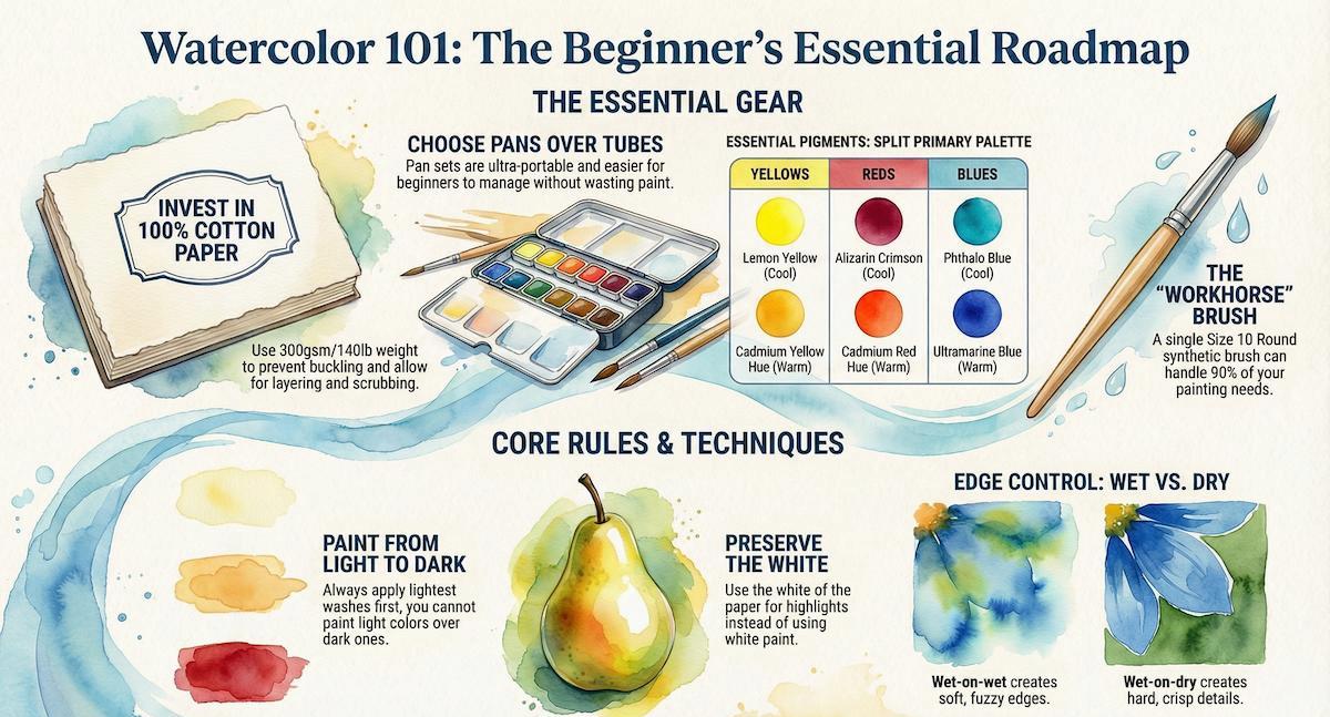
A. Pans
Pros: Ultra-portable. Great for travel and sketching. Harder to waste paint.
Cons: It's not easy to mix large puddles of dark color quickly.
B. Tubes
Pros: Instant, intense color. Essential for large washes.
Verdict: Start with pans or a mix. It is easier to manage as a beginner.
C. Grade: Student vs. Professional
Student grade (e.g., W&N Cotman, Van Gogh): Often good, but they commonly use synthetic fillers instead of expensive minerals.
Professional (e.g., Daniel Smith, W&N Professional): Higher pigment load and often containing expensive or exotic pigments.
Verdict: Start with a good student grade. W&N Cotman is ideal.
You do not need white. You use the paper for white.
The Essentials:
Lemon Yellow (or Hansa Light): The "cool" yellow.
Cadmium Yellow Hue (or New Gamboge): The "warm" yellow (golden).
Cadmium Red Hue: The "warm" red.
Alizarin Crimson (Permanent): The "cool" red (essential for purples).
Ultramarine Blue: The "warm" blue. Granulates beautifully.
Phthalo Blue (or Intense Blue): The "cool" blue. Stains the paper heavily.
Burnt Sienna: An earth tone. Mix with Ultramarine to make a perfect grey/black.
Payne's Grey: A cool, blue-black for shadows.
Note on "White Paint": Most watercolor sets include "Chinese White." Pros rarely use this for mixing because it makes colors look chalky. Use it only for final highlights at the very end.
Detailed guide available in the "Brushes" section.
Material: Start with synthetic or synthetic blend.
Why? You need a brush that holds a lot of water but comes to a sharp point, without paying a small fortune.
Shapes:
Round: You can do 90% of a painting with a single Size 10 round brush.
Flat: Only needed if you paint large skies.
Handle: Short handles only. (You paint flat on a table).
In oils, the canvas is just a support. In watercolor, the paper is part of the artistic chemistry.
A. Wood pulp (student grade)
Pros: Inexpensive. (Strathmore 300/400 Series).
Cons: The water sits on top. If you try to scrub or layer, the paper peels and piles up.
Verdict: Okay for practice, but frustrating for finished work.
B. 100% cotton (professional grade)
Pros: The paper absorbs water evenly. You can lift color, scrub, and layer multiple times.
Cons: More expensive (Arches, Fabriano).
Verdict: If you can afford it, start with cotton paper. It makes learning much easier because the paper behaves predictably.
C. Weight
- Always buy 300gsm / 140lb. Anything thinner will buckle when wet.
This is the opposite of oil painting.
The logic:
Because watercolor paint is transparent, you cannot paint a light color on top of a dark color.
Step 1: Paint your lightest colors (yellows, pale skies).
Step 2: Paint your mid-tones.
Step 3: Paint your darkest shadows and details last.
Preserve the White: If you want a white cloud, you must paint around it. Do not paint the sky blue and try to add a white cloud later.
A. Wet-on-Wet
Action: Wet the paper with clear water first, then touch paint to it.
Result: Soft, fuzzy edges. Great for skies and backgrounds.
B. Wet-on-Dry
Action: Paint wet paint onto dry paper.
Result: Hard, crisp edges. Great for buildings, trees, and details.
Walk into the store and grab these items.
The Paint (student grade - Cotman/Van Gogh):
A "Sketchers Pocket Box" (Pan set) usually contains all the split primaries you need.
OR buy tubes of: Lemon Yellow, Cad Yellow Hue, Cad Red Hue, Alizarin Crimson, Ultramarine, Phthalo Blue, Burnt Sienna.
The Tools
Brushes: Size 10 synthetic round, Size 4 synthetic round.
Paper: Arches 140lb Cold Press Block (or Canson XL Watercolor Pad for budget).
Palette: Plastic mixing tray (usually built into the pan set).
Water: Two jars (dirty/clean).
Towel: Paper towel or sponge to control how much water is on your brush.